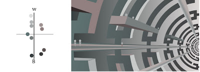
Step 1. Black and White abstract graphic design

Step 2. Complimentary color scheme
Step 3. Monochromatic
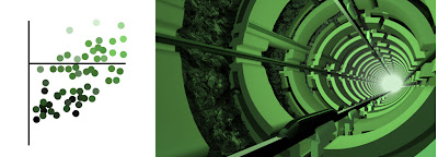
Step 4. Analogous color scheme
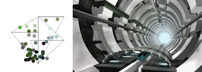
I'm currently working at Rhythm and Hues studios working on feature films. This is a blog of my artwork, WIP, and other images. I've been a professional digital artist for about 8 years now. I've won 1 Telly Award and 2 Regional Emmys for my commercial work. I graduated from The Columbus College of Art and Design. My major field of study was set/prop modeling and procedural effects for modeling and animation.


2 comments:
I really enjoy the progression of your pieces for this project. I'm in the class after yours, so I never got to see them. It seemed like everyone I talked to said they were amazing, so I had to check them out.
Did you have this concept in mind from the beginning? or did you just kinda think of it as you went along?
I really enjoy the texture, lighting, and overall complexity of your final, gratz.
Well, I started out with another concept and was just sketching around and came up with the first part, and when I drew it I came up with the idea for the rest. Then I just kinda reversed engineered from there. Thanks for the comments. It took a lot of time/work to get the last step done. I really wanted to spend more time on the textures but just ran out of time. Thanks again for the comments!
Post a Comment